Experience level - Intermediate.
I used PSP 2018 but the tutorial can be followed in earlier versions of PSP.
Make sure you are using "Edit Mode"
SAVE OFTEN
Download zipfile of materials HERE
This will open a Google drive link.

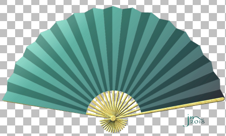
Preset Shape "jm_Chinese_fan_2.PspShape"
Timber pattern
"jm_light_timber"
Gradient "aqua hues"
Place Preset shape in PSP Files> Preset
shapes folder.
Place timber texture in your PSP Files>
patterns Folder
Place gradient in your gradients folder.
Open image 1000 X 1000 pixels of any
resolution that you wish, background, white.

Select Your preset
shapes tool and choose the preset shape jm_Chinese_fan_2.PspShape from the
shapes list. Make sure "retain style" is checked.

Hold down the shift
key and draw out your shape. [This will maintain the proportions of your shape]
A new vector layer will
automatically be created.

Object align>centre in canvas:

Open your vector layers
by clicking on tiny arrows indicated [+ sign in early versions of PSP]
Scroll down and
select "group 3"

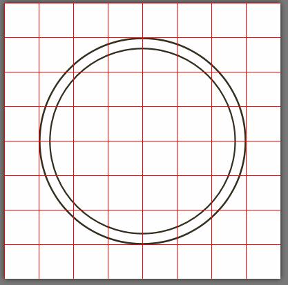
In the Selections
menu select "Selection from Vector object"

New Raster Layer.
And choosing your
flood fill tool and material gradient "aqua hues", fill your selection.
Then close off the
visibility of that layer.

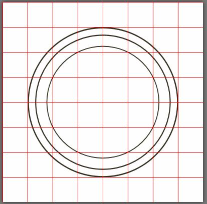
Return to Vector
Group 3, select the layer and with magic wand selection tool and these
settings, select the lighter of the grey areas [Note that “Continuous” is NOT
checked]:

Keep selection and
return to Raster 1 layer and return visibility.

Adjust Brightness and
Contrast:

Selection none.
The Struts of the fan [for want of a better name J]
Return to your vector layer and select
group labelled "back struts".

Selections>
Selection from Vector layer and then layer > New Raster Layer label "fan struts
back".

Use your fill tool to
fill selection with your timber pattern.


Deselect.
Return to your vector
group of back struts, open and select the bottom most strut in the layer.
Section from Vector
object.

Return to raster
layer with timber flood filled back struts and apply bevel.
Effects>3D effects> inner bevel with
these settings:
Rounded bevel, width
4 smoothness 0 depth 3 Ambience 100 Shininess 0 Color white angle 314 intensity
30 elevation 25.

To save a LOT of angst and time, now saved a quick script.
Make sure your
History palette is visible [ F3] and holding down the shift key select the last
three actions and hit the save button:

Return to your Vector
layer and select the next strut in the group [2nd bottom]
Hit the
"run" button of your quick script:


Continue selecting each strut in turn and use your quick script until
you come to last strut in "pile":

Deselect.
By applying the bevel
in this manner rather than to the whole layer as one effect, you can get a
sense of the different layers of the struts.
As you can see, the strut on the far right
hand side should sit on top of the fan material.
It too will need to be filled and bevelled.
Return to Vector
layer and select the sublayer "top strut"

Selection from Vector
layer, new raster layer and fill timber pattern as before and apply same bevel:

Select None. Bring
layer to the top and rename "top strut".

Return to vector
layer and select sublayer "pin", create selection from vector layer,
new raster layer, fill and apply bevel.
Move layer to top.

Deselect.
Close visibility of
background and vector layer and merge raster layers.[merge visible]

You are left with 3
layers.[two not visible]
Crop and save image
as .pspimage or transparent.png image and decorate as you wish.

My decoration was
applied as an "overlay" layer to maintain the shadowing effect.

Please feel free to use your own materials
and experiment with different bevel settings etc.
Comments welcome!
Judy
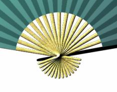
In the image below I have used different materials and lowered the opacity of the @material@ layer of the fan before decorating and merging.