
There are some really lovely textures available or you may even have something that you have created yourself which would lend itself as an interesting but not too intrusive canvas background.
Remember, if your image is large you will also need a texture image large enough to fit and hopefully room to spare:)
I hope I have written it clearly enough for those of you who are relatively
inexperienced in Paint Shop Pro
Perhaps it may help you think a little outside the square and experiment with some features that you haven't tried before :)
Below I will explain what I did with my particular image but really, playing with various textures and settings is the best way to learn.
You can download a PDF file of this tutorial HERE
You can download a PDF file of this tutorial HERE
In this particular case I wanted to blend my flowers into the background, rather than extract them precisely and place them "on top". This sort of method suits a flower such as a rose with a soft edged look.
This was a photo of one of my roses "Seduction" which I took on Friday
morning early.[much reduced in size]

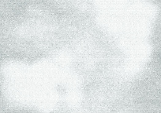
Sorting through my folders of textures I found one whose colour cast [blue]
wasn't quite what I wanted but had the sort of painted surface look that I was
after and it was a size that was sufficiently large.
[Some similar textures on my website HERE}

I promoted my background to layer [Layer> promote to layer ] and roughly
selected the area that I wanted with a rectangular selection tool, then inverted
selection and deleted.

I then copied my modified texture and added it as a new
layer to my flower before dragging this layer under my flower layer.
As you can see it is quite a lot larger than my canvas area which will
allow me to move it around later if I wish, to get the piece of it that I
want.
If your texture is a bit small you can stretch it into shape a bit . [as it
is an abstract sort of image a bit of distortion isn't going to matter too
much]

Now to work on flower layer.
I selected the layer with the flower image.
Layer> new mask layer hide all.

My flower disappears:

In the mask Layer group, I opened the layers within and reveal the actual
mask and worked on this.
Now with a large WHITE soft brush I worked from the centre of the image to
reveal the flowers.
[Click on the image below to show my brush settings]

I worked towards the edges but concentrated mostly on the centre of the
roses as I wanted to allow the edges to fade into the background.


I changed the blend mode of the layer group to soft light. and also linked
all the layers within the group.[more of that later]


I then duplicated this layer group and changed the duplicated layer back to
normal mode.
With my soft brush and BLACK fill opacity 50% I worked around the edges of
my flower area on the mask to reveal a little less of the flower . {some of the
edges on the layer below then appeared ..but softly. I lowered the opacity of
this layer group to 80%

As you can see the centre of the rose needed boosting back to normal
:)
I again duplicated my mask group and increased opacity of this layer group
back to 100%
[I now had 3 flower layers all masked]

I carefully selected the mask layer in the topmost layer group.
This time I completely floodfilled my mask layer with black.
I then changed my foreground material back to white and working only the
area with the stamens revealing that area [ again with a soft brush].

Zooming in to 40%

Now I turned my attention to recolouring my background.
After some trial and error [aka fiddling about :) ] :
Choosing a colour from my image I floodfilled a new layer above the
background and changed the blend mode to burn.
I duplicated this layer and changed the blend to soft light.
This gave me a rather attractive pinkish tone to the background but I
needed a little colour contrast.
Green is always a safe choice with pink.
With a new layer , flood filled with a fading gradient of a soft green
[blend "color"]
It wasn't quite "warm" enough for my liking so I added a new layer and
flooded with a light cream [blend mode soft light.]
I then adjusted the opacity of these layers to something I liked .

As you can see the colouring is still fairly subtle and doesn't overpower my
flowers.

Because I had linked all the masked flower layers I was able to move them
together around my canvas with the move tool :)...very handy if I wanted to add
any text.


The many layers left unmerged allowed a lot of potential for adjustment if
I wasn't happy with the colour print out.
Also by giving myself so much canvas room, I had lots of cropping options
available too.


Finally [click on image to enlarge]

Another version HERE
Judy
PS Some good links to textures --many free
If you have any queries or suggestions please add a comment.:)


